Final project
I started off with the face of a zombiefied clown predator-like figure by sketching it out onto photoshop using the wacom tablet. Because as if zombies werent enough, i had to add in a clown for the sake of living my childhood fears as best i can.
When doing the clown, i didnt think of how it would fit exactly because if i did, i would have restrictions on my figures looks and i would definetly not be satisfied so i went along with how i wa=ished for it to look and i would later in the future adjust everything with it.
As you can see above, i layered the jaw with different shades making it easier to fill in when putting on the details. as i wish for the movie title to be in between the teeth, i later cut in between the jawline to give an extended broken jaw, well played if you ask me.
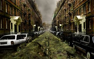
One of the most important is choosing the right backdrop for your standee, everything from lighting to setting needs to be just right. In my case, i decicded on using a clown for my standee so i needed a backdrop that would maybe consist of a carnival or circus in town.
It just gets creepier doesnt it?

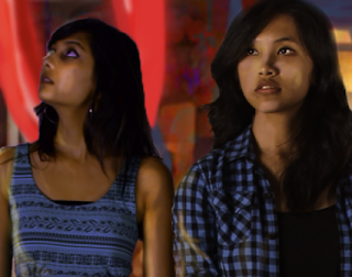
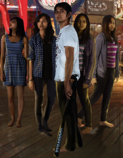
i then took various photographs of the main characters looks for the standee. Trying out different poses gave me a wider range of looks towards the whole layout of the standee. ofcourse some editing needed to be done.
I cut out each character from various photographs using the pen tool which allowed for a smoother and more natural look in photoshop when transported. If you look closely, one of them even has a twin. Owh the beauty of photoshop.
 even on the faces and clothes, every shadow counts as it sets the mood and convincing backdrop look.
To fit to the lighting of the background, some higlights and shading needed to be done. as you can see, using the simple way of just brush tooling and some dim lighting colours, straight strokes are enough. dont forget to always open a new layer before trying something new.
For my title i used this for a circus like display as a template.
I made outlines for the image using adobe illustrator so i could styler it for my own use.
Voula (:
I printed the seperate layers on sticker paper and then stuck it on foam board for the final 3d view (:


No comments:
Post a Comment