Thursday 17 October 2013

EXPLODING shapes.

week 8
expansion of objects, 3D - Mr Jeffrey

This time we learnt something completely new and different! instead of going the old way of 2d images and photographs to sketches, we learnt to actually make objects and images more 3d! Heres how we did.

First off i went to the Objects tool under the Text tool and made a simple 2D square shape. Then i went to Effects > 3D > Extrude & Bevel... Here i played around with the dept and also added perspective as seen below (:


After this, you realise that you can't really do much with it, more like an expanded 2D object. What we did then was we went to Object > Expand Appearance and then ungroup [command + Shift + G] on the mac. 


This literally ungroups all the faces of the square whereby you can now actually pull apart the box!


You can close your mouth anytime now. (;

NEXT

Done a little star gazing lately? well its your luck.

We drew two stars, preferably one different from the other and both in neon glow from the neon effects menu from graphic styles in window!


After this we go to the object menu > Blend > Make
This gives your stars a special inception effect! 


..if not yet then you may have to go to Blending options, Change spacing to specified steps and adjust the number upto to 120 or so and see the magic.


An amazing piece of art yet again, but becareful not to add too much to your spacing if not your piece may end up looking alot like the one below, there are colours but too little amount of space to actually enjoy the view with.


 And now ladies and gentle men, the grand finale of todays show, 3D Magic!
FIRST OF ALL, i drew a simple yet so intricate of a line using the pen tool.
Not forgetting to save my work often. As you can see o the top right here, i drew a little curve.


..Then highlighted it neon blue because so can you.
Now heres where the magic comes in.


Go to Effects while your line is still selected,  3D > Revolve > Extrude & Bevel 


This allows you to extract or expand the object and give it a sort of depth!
As you can see on the top right, here, i even added depth so the object can be seen like its being stretched ever so simply.


..here are some screencaps of a rotation being done to show that that square on the right can be rotated in place of your object to see which direction it would be facing. 


AND THE MAGIC CONTINUES

Do the same except go to Revolve this time, now revolve this time (;


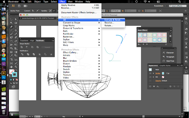
you should get this pop up shown below..
Just like the Extrude & Bevel but if poses as a different function. this doesnt bring out the object but instead it makes a pattern going around 360 degrees using just one of the lines that you had drawn!


If you can see the little selection towards the bottom written "from - [left edge]" change it to "right" and this what you would see [below] (;


There you have it. a rotation of what you have just seen, this is 3D no joke. you can even change the shading to "wires" for a professional look. Hard to believe that all this is just from a single line. The power of a single line. Never underestimate.


FIN. (:

WELCOME TO ZOMBIELAND.

week 7
Progressive layer masking, Blending modes - Mr Adam

Our main task by the end of the semester is to do a movie poster in which this assignment helped alot.
We made a poster of an abandoned bus where we were supposed to be focused on it just being abandoned but when you get into something, you get carried away. also i love zombies.

Shall we?


Here we have a bus which we worked on.

AAND THIS my friends, is what happens when you let purple dinasours drive buses.


JUST kidding, hell be fine.

moving on :D 


I first started off with various textures that can be used to resemble an old tattered abandoned bus.
This image on the right is of a golden brown rust formation. Textures provide the visual impact in our minds to specify or identify what we are looking at and sometimes even how long it has been around.


To show that the bus has been around for awhile i added this image and did the multiply blend mode to bring the images together giving an old moss texture to the bus.


With the actual image of the bus, this is what we can see, how the texture blended with the bus including the tyres. Moving the image of the bus you can see the added features like blood pools and broken windows.


An abandoned bus isn't complete without shattered windshields and mirrors!
I tried out with several shattered glass textures. Its a different case for every movment for example if you want to show that someone flew out the windscreen, the glass should have a hole in it or if someone had just knocked their head hard on the window you may just need a glass with large cracks like the one above (:


For a more dramatic effect i then added blood stains and pools! the only way this would be more believable in the poster would be the way you actually place the images of the blood.


SPLAT like a shot to the head. For a person who just hates blood, i find this rather cool and interesting.


The effects of blood like such should show on other places aswell such as the floor, blood drops, as show below.


TWO of the MOST important things to rember when you are working on a computer and photoshop is to:

1. ALWAYS SAVE YOUR WORK

At every step, at every turn, at every click. Save your work before you start, this way there is already a file present whereby you can quickly click 'command + S' [MAC] and your work would be saved. 

The reason being that sometimes without notice softwares can crash or close down unexpectedly with all your hard work gone to waste. ALWAYS save.

2. CREATE LAYERS 

In photoshop, in Illustrator and where ever possible. This always you to adjust different aspects of your work whenever you want without putting other areas at risk of being altered or being lost. 


For another added effect i did a favour of decapitating a purple dinosaur by the head as if it was chuked out the windscreen. I must also add that it sets the mood for the overall creepy yet awesome poster object.


Hope you guys like my movies if i make any in the future based on this (;

OFCOURSE it wasnt the only thing we did in a day, we exaggerated a little more on textures and also the forms of it.


In this exsercise we used an image of a hand and will attempt to add a texture to it. Iv'e decided to use snake skin texture for this.


I used the same method of applying the texture to the hands as so with the one with the aluminium can. Its that simple. The most important element would be the wrap tool. 

The texture would be 'wrapped' or positioned from every corner to give a curved and angled effect on the hand.


here are 3 levels or more so the number of times i actually wrapped my texture around the hand. our hand has many complex curves and angles which is why it is needed to be done individually, angle by angle, curve by curve. 

Fin. (: 

Graffiti art, my second nature

Week 6
Proportions, scales - Mr Adam

a new week, a new chapter in the design course. This week we learnt how to do a little cheating with design in photoshop and how simple technology can make our lives.

we started off with getting an image of a brick wall as such


THIS my friends, is a wall. When graffiti artists paint, this is thier canvas! mostly noted as a form of vandalism yet in the most aesthetic of ways.

My task was to add an image or art by a graffiti artist on this wall without me actually spending money on spray cans or touching anything in its form for that matter, how? lets see how it goes.


The image i have chosen is this beautiful piece done by a renowned graffiti artist in the UK known as Banksy, a secretive yet not so secretive individual as his work in the UK is famous around the world.

After getting the image i want, place the image infront of the wall image like so..


Now one thing you would want to be sure of is that the image you want to place on the wall has a white background as this works best with colour gradients. Now select this image, go to the bar just above the layers column where it is stated 'normal'. These are one of many types of modes known as 'blending' modes allowing 2 images to overlap in several ways depending on their colour values.

The mode i choose would be multiply


..and there we have it, the blending mode, multiply, allows the girl to be placed nicely according to the texture of the wall. Graffiti at a click of a mode. (;

Now we didnt stop here, we moved on to something just a little more intricate. Designing an aluminium can. Thats right, those graphics you see on the cans can be done on photoshop!

Lets start off with our main object image. a can.


Any can like this would do, you wouldn't need a can with decals as you would be doing one any ways and the brighter the can, the better the outcome.


After placing the can i find an image that would be interesting to find on an object as such, in my case i chose a fan art sketched version of the A v e n g e r s. Nothing can really be more amazing on a can..  can it?


As it being a flat image, i use the warp tool to hinge the image rounded according to my base which in this case would be the can. after warping it as accurate as possible we can use the same blending mode process for the images to give a realistic effect. [Multiply Mode]


AND there you have it. i took my time warping out the image as accurate as possible here. Just for a little fun i added the joker here aswell on another try (;


Not bad i must say, i was really impressed by how far technology has really brought us.

Fin.